How to Create a Spider Chart in Google Slides™ (Step-by-Step Guide)
December 22, 2025
Picture this: you're preparing a performance review presentation, and you need to compare three team members across six different skills. Or maybe you're evaluating competing products and want to show how they stack up on features, price, performance, and support all at once.
A bar chart? Too cluttered. A table? Nobody reads those. What you need is a spider chart—that web-like visualization with multiple axes radiating from the center. Some people call them radar charts or web charts, but they all do the same thing: show you the complete picture at a glance.
Here's the catch: Google Slides™ focuses on the most commonly used chart types—pie, bar, line, and area charts. Spider charts aren't included in the native options, which makes sense given they're more specialized.
So what do you do? This guide walks you through two options: the clunky workaround using Google Sheets™, and the much better way using ExtraChart that lets you build these charts right inside your presentation.
When Should You Actually Use Spider Charts?
Before jumping into the tutorial, let's talk about when these charts actually make sense. I've seen people try to use spider charts for everything, and trust me, they don't always work.
Spider charts are great for:
- Comparing employees or candidates across multiple skills (communication, technical ability, leadership, etc.)
- Evaluating products side-by-side on different features
- Showing performance across various KPIs in one view
- Mapping your brand perception against competitors
- Visualizing team strengths across different competencies
The sweet spot? Around 4-8 variables (axes) and 2-4 things you're comparing. Go beyond that and your chart turns into a confusing mess.
Method 1: The Workaround (Google Sheets™ + Slides)
Google Slides™ doesn't offer spider charts natively, but you can create one in Google Sheets™ and link it to your presentation.
Step-by-Step:
-
Open Google Sheets™ and create your data table
- First column: Your variable names (e.g., Communication, Technical Skills, Leadership)
- Additional columns: Your data series (e.g., Employee A, Employee B)
-
Insert a Radar Chart
- Select your data range
- Go to Insert > Chart
- In the Chart Editor, change chart type to Radar chart
-
Customize in Sheets™
- Adjust colors, labels, and gridlines in the Chart Editor
- Make sure it's presentation-ready
-
Copy to Google Slides™
- Click the chart and copy it (Cmd+C or Ctrl+C)
- Paste into your Google Slides™ presentation
- Choose Link to spreadsheet to keep data synced
Why This Method Kinda Sucks:
- You're constantly switching between Sheets™ and Slides. Change one number? Back to Sheets. Adjust a color? Back to Sheets.
- The styling options in Google Sheets™ are... let's just say "basic." You get what you get.
- Sometimes the link breaks and your chart just stops updating. Fun times.
- Every single edit means opening the spreadsheet, making the change, going back to Slides, and clicking update.
Look, if you're making a quick chart for an internal team meeting, this'll get the job done. But if you're presenting to anyone who matters—clients, executives, investors—you probably want something that doesn't look like you threw it together in five minutes.
Method 2: The Professional Way (Using ExtraChart)
ExtraChart is a Google Slides™ add-on designed specifically for creating advanced charts—including spider charts—directly in your presentation. No spreadsheet required.
Why Use ExtraChart Instead?
- No more tab gymnastics - Edit everything in the sidebar. Your data, your colors, your labels. All right there.
- See changes instantly - Tweak a color? It updates immediately. Change a number? Boom, updated. No refresh button needed.
- Actually looks professional - Pre-made color palettes that don't look like they came from 2005.
- Full control - Transparency, gridlines, fonts, spacing—you can adjust everything.
- Edit anytime - Click the chart later and all your data loads back up. No "start from scratch" nonsense.
Step-by-Step Guide:
Step 1: Install ExtraChart
- Install it directly from the Google Workspace™ Marketplace
- Or in Google Slides™, go to Extensions > Add-ons > Get add-ons, search for "ExtraChart", and click Install.
Step 2: Launch ExtraChart
- Go to Extensions > ExtraChart > Create & Edit Charts
- The ExtraChart sidebar will open on the right
- Browse the chart library and select Radar Chart (spider chart)
Step 3: Enter Your Data
ExtraChart includes a built-in spreadsheet editor—no need to switch to Google Sheets™.
- Click the Data tab in the sidebar
- Enter your variable names in the first column
- Add your data series in subsequent columns
- The chart preview updates in real-time
 Type your data right here in the sidebar. No switching to Google Sheets™, no linking, no syncing issues.
Step 4: Customize Your Chart
ExtraChart gives you full control over your spider chart's appearance:
Color & Style:
- Choose from curated color palettes or create custom colors
- Adjust fill transparency for overlapping data series
- Customize border thickness and style
Gridlines & Axes:
- Show or hide concentric gridlines
- Set the number of gridline levels (3-5 works best)
- Customize gridline color and opacity
- Add or remove axis labels
Legend & Labels:
- Position the legend (top, bottom, left, right, or none)
- Customize font sizes and styles
- Show or hide data point markers
Step 5: Insert Into Your Slide
- Click Insert the chart in the ExtraChart sidebar
- The chart appears on your slide as a high-quality image
- Position and resize as needed
Step 6: Edit Anytime
Need to update your data or change the design?
- Select the chart on your slide
- Click Edit a chart in the ExtraChart sidebar
- Your data and settings reload instantly
- Make changes and click Update to refresh the chart
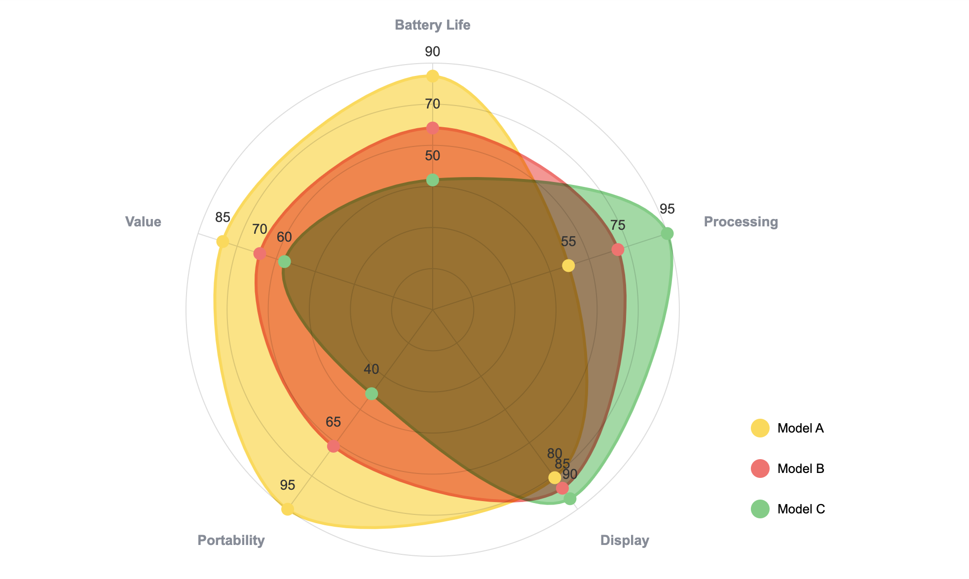 Laptop comparison showing distinct performance profiles—Model A wins on battery and portability, while Model C dominates processing power.
How to Not Screw Up Your Spider Chart
I've seen a lot of bad spider charts. Here's how to avoid making one yourself:
Don't Go Overboard with Variables
Keep it to 4-8 axes. I know you want to show everything, but 12 axes just looks like a mess. If you have fewer than 4, honestly just use a bar chart.
Put Everything on the Same Scale
This is huge. If one axis goes from 0-100 and another goes from 0-10, your chart will be completely misleading. Normalize everything to the same scale (like 0-100 or 1-10 across the board).
Make Your Colors Actually Distinguishable
When you're comparing multiple things:
- Pick colors that actually look different from each other
- Add some transparency (30-50%) so you can see where things overlap
- Please, for the love of accessibility, use color-blind friendly palettes
Less Is More
Comparing 2-3 things? Perfect. Comparing 6 things? Your audience will give up trying to read it. Keep it simple.
Labels Should Be Short and Sweet
No one wants to read "Year-over-Year Revenue Growth Percentage" on an axis. Just write "Revenue Growth." Put labels outside the chart where people can actually read them.
Real Example: Hiring the Right Person
Here's a scenario I see all the time. You're hiring for a senior role and you've narrowed it down to two candidates. Both look good on paper, but you need to show the hiring committee why one is a better fit.
You set up a spider chart with six competencies:
- Technical Skills
- Communication
- Problem Solving
- Leadership
- Teamwork
- Adaptability
Then you plot:
- Candidate A (blue)
- Candidate B (green)
- Your department average (gray, as a baseline)
What jumps out immediately? Candidate A is a technical powerhouse—great at problem-solving and technical work—but the leadership score is pretty weak. Candidate B is more balanced, with strong communication and teamwork, but not quite as technically sharp.
Depending on what your team needs (a technical specialist vs. a future team lead), the answer becomes obvious. And when you show this chart to the hiring committee, they get it in about three seconds.
That's the power of a good spider chart.
When to Use Something Else
Use a spider chart when:
- You're comparing 2-4 things across multiple metrics
- You want to show overall patterns, not exact numbers
- Your variables are somewhat related
Use something else when:
- Bar chart - You need precise values and easy comparisons
- Line chart - You're showing trends over time
- Table - Exact numbers matter more than the visual
- Heatmap - You've got tons of variables and data points
Bottom Line
Spider charts are genuinely useful when you need to compare multiple things across several dimensions. The problem is Google Slides™ makes you jump through hoops to create them.
If you're just making a quick chart for your team's Monday standup, sure, use the Google Sheets™ method. It's clunky, but it works.
But if you're presenting to anyone outside your immediate team—clients, executives, board members—you probably don't want to waste an hour fighting with spreadsheet links and limited styling options. That's where something like ExtraChart makes sense. You build the chart right in Slides, customize it however you want, and you're done.
No tab switching. No broken links. No "why won't this update" moments right before your presentation.
Just a clean, professional chart that actually looks good.
Create Stunning Spider Charts Instantly
Try ExtraChart to build professional spider charts directly in Google Slides™.
Get Started for FreeNeed help with other chart types? We've got guides on pie charts, funnel charts, and bar charts. Want to go deeper on radar chart theory? Check out our complete radar chart guide.