Radar Charts Deep Dive: When to Use Them (And When Not To)
December 21, 2025
Ever opened a presentation and seen one of those web-like charts with multiple axes radiating from the center? That's a radar chart (also called spider charts or star plots), and they're surprisingly polarizing in the data viz world.
Here's the thing: radar charts are like a Swiss Army knife. In the right hands, they reveal patterns that bar charts and line graphs just can't capture. But use them wrong, and you'll leave your audience scratching their heads.
This guide cuts through the confusion. You'll learn exactly when radar charts shine, when to avoid them, and how to build professional ones in Google Slides™ using ExtraChart—without needing a PhD in data science.
What Are Radar Charts?
A radar chart is a two-dimensional chart that displays multivariate data on axes starting from the same central point. Each axis represents a different variable or metric, and data values are plotted along these axes and connected to form a polygon.
Key Characteristics
- Multiple axes: Each variable gets its own axis radiating from a central point
- Circular layout: Axes are arranged in a circular pattern (typically equidistant)
- Polygon formation: Data points are connected to create a closed polygon shape
- Comparative visualization: Multiple data series create overlapping polygons for easy comparison
The resulting shape allows viewers to quickly assess the overall "profile" of the data and identify strengths, weaknesses, and patterns across multiple dimensions.
When Should You Use Radar Charts?
Radar charts aren't for everything. But when the conditions are right, they're hard to beat. Here's when to pull them out:
1. Comparing Multiple Entities Across Multiple Variables
Radar charts are ideal when you need to compare 3-6 entities (like products, candidates, or strategies) across 4-8 different metrics.
Example Use Cases:
- Comparing smartphone models across battery life, camera quality, performance, screen quality, and price
- Evaluating employee performance across communication, technical skills, teamwork, leadership, and adaptability
- Analyzing competitor products across multiple feature dimensions
2. Showing Performance Profiles
When you want to display a holistic "profile" or "fingerprint" of performance across multiple dimensions, radar charts create an intuitive visual.
Example Use Cases:
- Skills assessment dashboards
- Brand perception analysis across different attributes
- Sports player statistics (speed, strength, agility, endurance, technique)
- Product quality assessments
3. Identifying Patterns and Outliers
The polygon shape makes it easy to spot:
- Balanced vs. unbalanced profiles (symmetrical vs. asymmetrical shapes)
- Standout strengths (vertices that extend far from the center)
- Weaknesses or gaps (concave sections of the polygon)
4. Cyclical or Periodic Data
When your data has a natural cyclical pattern or when the first and last variables are conceptually related, radar charts work particularly well.
Example Use Cases:
- Monthly sales patterns over a year (where December connects back to January)
- Hourly website traffic patterns
- Directional data (compass readings, wind patterns)
When NOT to Use Radar Charts
Look, I get it—radar charts look cool. But sometimes that polygon shape does more harm than good. Skip radar charts if you're dealing with any of these:
1. Too Many Variables (>8-10)
Radar charts become cluttered and difficult to read when you have too many axes. The more axes you add, the harder it becomes to distinguish between them and accurately assess differences.
Better Alternative: Use a parallel coordinates chart or a table with conditional formatting.
2. Too Many Data Series (>4-5)
Overlapping polygons become visually confusing when you compare more than 4-5 entities simultaneously.
Better Alternative: Create multiple smaller radar charts or use a grouped bar chart.
3. When Precise Values Matter
Because of the circular layout and varying angles, it's difficult to accurately compare values on different axes. If your audience needs to know exact numbers or make precise comparisons, radar charts fall short.
Better Alternative: Use a table, bar chart, or dot plot for precise value comparisons.
4. Variables on Different Scales
Radar charts work best when all variables use similar scales or can be meaningfully normalized. Mixing percentages with absolute numbers or combining vastly different scales creates misleading visualizations.
Better Alternative: Standardize your data first (e.g., convert to percentiles or z-scores) or use separate visualizations.
5. Negative Values
Standard radar charts struggle with negative values since they plot outward from a central point. While some variations can handle negatives, they often become confusing.
Better Alternative: Use a diverging bar chart or line chart.
6. Order Matters
The arrangement of axes significantly affects the polygon's shape. If changing the order of variables would substantially change the interpretation, a radar chart may not be appropriate.
Better Alternative: Use visualizations where order doesn't affect perception, like bar charts or tables.
Radar Chart Best Practices
Want your radar charts to actually work? Here are the rules that separate amateur hour from professional presentations:
Design Principles
1. Limit Your Variables
Optimal range: 4-8 variables
- Fewer than 4: The chart shape becomes too simple; use a bar chart instead
- More than 8: The chart becomes cluttered and hard to read
2. Normalize Your Data
Since all variables share the same radial distance, they must be on comparable scales. Options include:
- Percentage of maximum: Scale each variable from 0-100% based on its maximum value
- Percentile ranking: Convert values to percentile ranks (0-100)
- Z-scores: Standardize to show standard deviations from the mean
- Min-max normalization: Scale all variables to a common range (e.g., 0-10)
3. Choose Meaningful Start and End Points
The center of the radar chart should represent a meaningful zero or baseline. Common approaches:
- Zero (absolute minimum)
- Industry average
- Minimum acceptable performance
- Previous period performance
4. Consider Axis Order
While there's no universal rule, thoughtful ordering can enhance comprehension:
- Group related variables together (e.g., all financial metrics adjacent to each other)
- Arrange by importance (clockwise from top)
- Create visual balance to avoid misleading asymmetry
5. Use Distinct Colors with Transparency
When comparing multiple data series:
- Use contrasting colors that are easily distinguished
- Apply transparency (30-50%) to overlapping polygons so all series remain visible
- Ensure color-blind friendly palettes
- Use distinct border colors for additional differentiation
6. Label Clearly
- Place axis labels outside the chart at the end of each axis
- Use concise labels (2-3 words maximum)
- Consider rotating labels for better readability
- Add a legend if showing multiple data series
7. Include Gridlines Wisely
- Use subtle concentric circles to show scale intervals
- Avoid too many gridlines (3-5 levels is usually sufficient)
- Make gridlines much lighter than data polygons
- Consider labeling gridlines with values
8. Provide Context
- Add a title that explains what's being compared
- Include a subtitle explaining the scale or normalization method
- Use annotations to highlight key insights
- Consider adding a reference polygon (e.g., industry average) for context
Interpretation Tips
Help your audience correctly interpret radar charts:
Focus on Shape, Not Just Size
The overall shape reveals the profile:
- Circular/symmetrical: Balanced across all dimensions
- Elongated: Strength in certain directions, weakness in others
- Irregular: Highly variable performance across dimensions
Compare Areas Carefully
While larger polygons generally indicate higher overall performance, this can be misleading if:
- Axes are not equidistant
- Variables are not equally weighted in importance
- The order of axes creates artificial area differences
Look for Overlaps and Gaps
When comparing multiple series:
- Overlapping regions: Areas of similarity
- Non-overlapping regions: Clear differences
- Which polygon extends further: Indicates which entity performs better on that dimension
Common Mistakes to Avoid
1. Using Radar Charts for Time Series Data
Unless your time series is cyclical (like monthly data across a year), a line chart is almost always better for showing trends over time.
2. Failing to Normalize Data
Plotting raw values with different units or scales creates a meaningless visualization where some axes appear more important simply due to their scale.
3. Overcrowding the Chart
Trying to show too many variables or data series results in a confusing, unreadable mess.
4. Using Area Shading Inappropriately
The area of a radar chart polygon can be misleading because:
- It's affected by axis order
- It weights diagonally adjacent variables
- It doesn't represent a meaningful metric in most contexts
If area is important, explicitly calculate and display it, or use a different visualization.
5. Ignoring Accessibility
Radar charts can be challenging for users with color blindness or visual impairments. Always:
- Use patterns or textures in addition to colors
- Ensure sufficient contrast
- Provide alternative data tables
- Test with accessibility tools
6. Inconsistent Axis Scales
Using different minimum and maximum values for different axes distorts comparisons and creates misleading visualizations.
Creating Radar Charts in Google Slides™ with ExtraChart
Here's the frustrating part: Google Slides™ has no built-in radar chart option. You'd think with all those chart types, they'd include spider charts, but nope.
The good news? ExtraChart fills that gap perfectly. You can build radar charts right inside your presentation without switching to external tools or hacking together shapes manually.
Step-by-Step Guide
1. Install ExtraChart
- Install it directly from the Google Workspace™ Marketplace
- Or open your Google Slides™ presentation, go to Extensions > Add-ons > Get add-ons, search for "ExtraChart", and click Install.
2. Prepare Your Data
Structure your data in a clear format with normalized values (e.g., 0-100 scale) to ensure all variables use the same scale.
Best practices:
- First column: Variable names
- Subsequent columns: Data series
- Use normalized values (e.g., 0-100 scale)
- Ensure all values use the same scale
 Enter your data directly in ExtraChart's built-in editor—no need to switch to Google Sheets™.
3. Launch ExtraChart
- With your data ready, go to Extensions > ExtraChart > Create & Edit Charts
- Select Radar Chart from the chart type library
4. Input Your Data
- Click on the Data tab and enter or paste your data into the data editor
- ExtraChart will automatically detect columns and rows
- Verify that variables and data series are correctly identified
5. Customize Your Chart
ExtraChart offers extensive customization options:
Style Options:
- Select colors for each data series
- Choose from pre-built color palettes
- Adjust fill transparency
- Customize border thickness and style
Axis Configuration:
- Customize axis labels
- Show/hide gridlines
- Set number of gridline levels
- Configure gridline shape, levels and labels
Legend:
- Position legend (top, bottom, left, right, none)
- Customize legend style
Advanced Options:
- Use custom fonts
- Create color-blind friendly palettes
6. Insert into Your Slide
- Click Insert the chart
- Position and resize as needed
- The chart remains editable—click Edit a chart to modify data or styling
ExtraChart Advantages for Radar Charts
- Professional design: Beautiful default styling that follows data visualization best practices
- Fully customizable: Control every aspect of your chart's appearance
- Easy updates: Edit data or design without recreating the chart
- Consistent branding: Save custom color palettes for reuse across presentations
- No external tools needed: Create sophisticated charts directly in Google Slides™
Real-World Radar Chart Examples
Example 1: Product Comparison
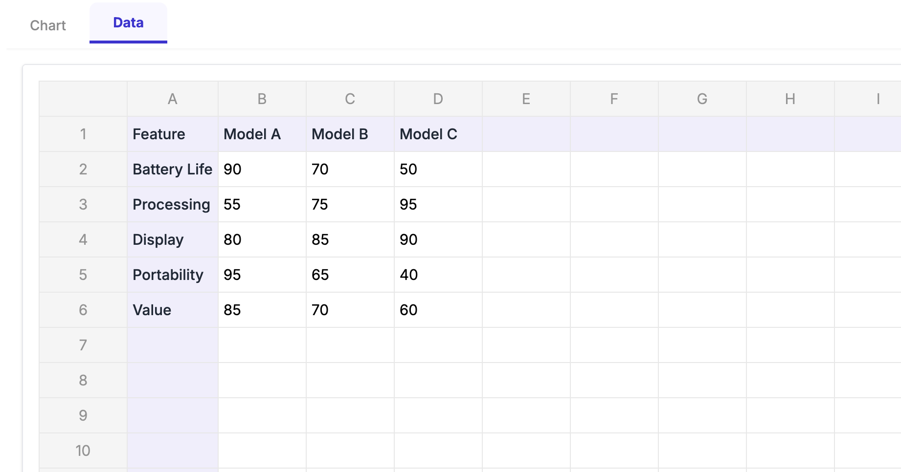
Scenario: A tech company comparing three laptop models across key features.
Variables:
- Battery Life (normalized to 0-100)
- Processing Power (benchmark scores normalized)
- Display Quality (expert ratings normalized)
- Portability (weight inverted and normalized)
- Value for Money (price-performance ratio normalized)
Implementation:
- Each laptop gets a distinct color with 40% transparency
- Gridlines at 20, 40, 60, 80, 100
- Clear legend identifying each model
- Title: "Laptop Model Comparison: Feature Profile"
Insight: The chart immediately shows that Model A has excellent battery life and portability but weaker processing power, while Model C excels at performance but sacrifices portability.
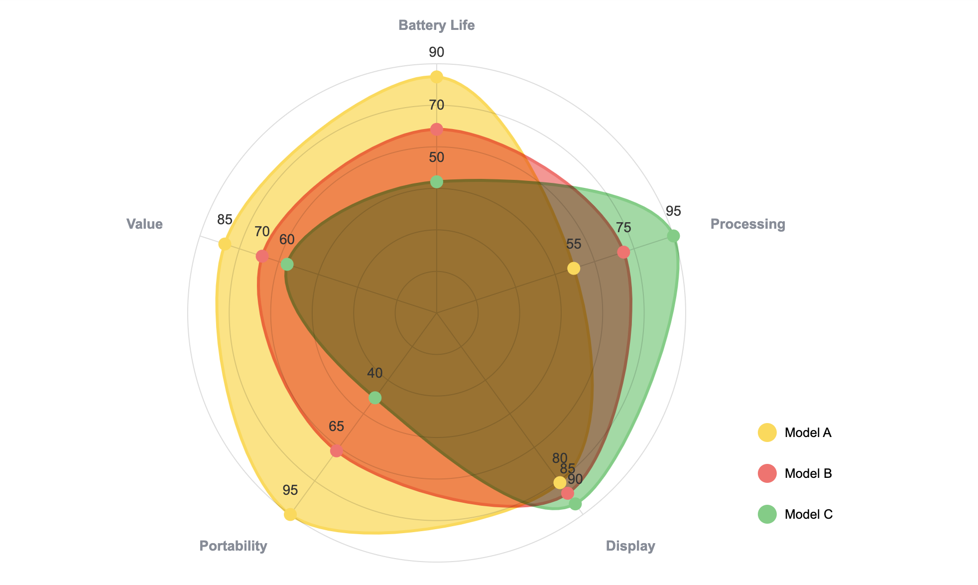 Laptop comparison showing distinct performance profiles—Model A wins on battery and portability, while Model C dominates processing power.
Example 2: Employee Skills Assessment
Scenario: HR department visualizing an employee's skills profile against department average.
Variables:
- Technical Expertise
- Communication
- Leadership
- Problem Solving
- Collaboration
- Adaptability
Implementation:
- Employee profile in solid blue (60% opacity)
- Department average as dashed gray line
- All metrics on 1-10 scale
- Annotations highlighting strengths
Insight: Visual gaps between the employee and average immediately identify development areas.
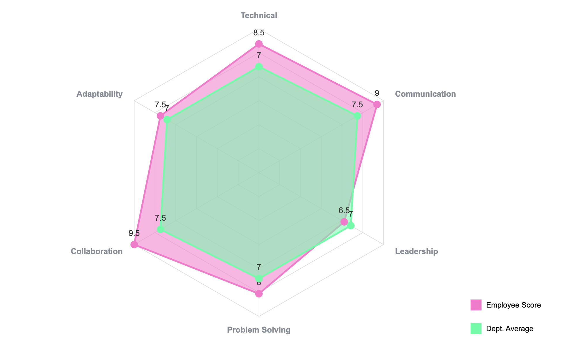 Skills assessment revealing strengths in Communication and Collaboration, with Leadership as a development opportunity.
Example 3: Brand Perception Analysis
Scenario: Marketing team comparing brand perception across attributes.
Variables:
- Innovation
- Trustworthiness
- Value
- Quality
- Customer Service
- Sustainability
Implementation:
- Own brand vs. two main competitors
- Color-coded by brand
- All metrics as percentile rankings (0-100)
- Reference circle at 50th percentile
Insight: The chart reveals perception strengths and weaknesses relative to competitors across all dimensions.
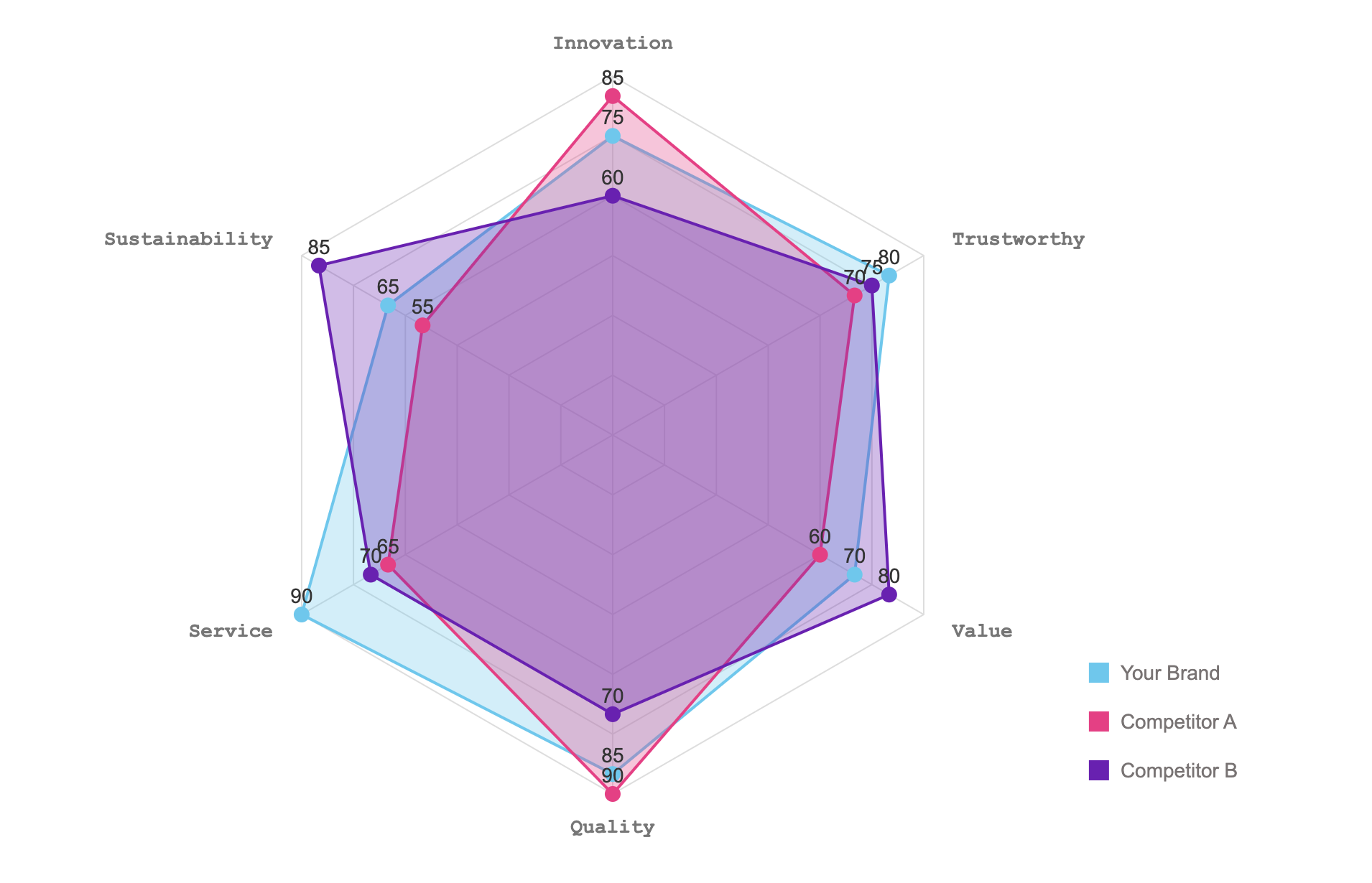 Brand analysis showing your brand leads in Service and Quality, while Competitor A dominates Innovation perception.
Alternatives to Radar Charts
If a radar chart doesn't fit your needs, consider these alternatives:
Parallel Coordinates Chart
Best for: More than 8 variables, preserving precise values
Advantage: Handles many variables without clutter; maintains value precision
Small Multiples (Bar Charts)
Best for: Comparing many entities across multiple variables
Advantage: Easy to read; precise values; scalable
Heatmap
Best for: Large datasets with many variables and entities
Advantage: Handles large numbers of variables and data series; excellent for pattern recognition
Table with Conditional Formatting
Best for: When precise values are essential
Advantage: Exact numbers available; easy to sort and filter
Grouped/Stacked Bar Chart
Best for: Comparing fewer variables with more precision
Advantage: Standard, familiar format; precise comparisons
The Bottom Line
Radar charts aren't going to work for every dataset. They're picky about what works well—too many variables and you've got visual spaghetti. Too many overlapping series and nobody can tell what's what.
But when the situation calls for it (comparing a handful of products across 5-6 key metrics, showing a skills profile, or visualizing cyclical patterns), radar charts tell the story faster than almost any other chart type.
The real trick is knowing when to use them and when to reach for a bar chart instead. Follow the guidelines in this article, normalize your data properly, and don't try to cram a dozen data series onto one chart.
With ExtraChart, you can skip the manual workarounds and build professional radar charts in minutes. No spreadsheet gymnastics, no switching between tabs—just clean, presentation-ready charts.
Quick Reference
When radar charts work best:
- Comparing 3-6 entities across 4-8 variables
- All your data is normalized to the same scale
- You want to show overall "profiles" rather than precise values
- The data is cyclical or the variables are conceptually related
When to skip them:
- More than 8 variables (gets too crowded)
- More than 5 overlapping series (visual chaos)
- Your audience needs exact numbers (use a table or bar chart)
- You have negative values or widely different scales
Ready to create your first radar chart? Install ExtraChart for Google Slides™ today and start visualizing your multivariate data with stunning, professional charts in minutes.
Create Stunning Radar Charts Instantly
Try ExtraChart to build professional radar charts directly in Google Slides™.
Get Started for FreeHave questions about radar charts or other data visualizations? Check out our other blog posts on spider charts, pie charts, funnel charts, and more. For the latest tips and updates, follow us on social media or subscribe to our newsletter.