How to Make a Pie Chart in Google Slides™
December 17, 2025
Pie charts are one of the most recognized ways to show how individual parts contribute to a whole. Whether you're presenting budget allocations, market share, or survey results, a well-designed pie chart can make percentages instantly understandable.
In Google Slides™, you have two main ways to create them: using the native tool connected to Google Sheets™, or using a specialized add-on like ExtraChart for more control and better aesthetics. This guide covers both methods.
Method 1: The Native Way (Google Slides™ & Sheets™)
Google Slides™ has a built-in feature to insert charts, which are powered by Google Sheets™ in the background. This is the standard method for most users.
Step-by-Step Guide:
- Open your slide and go to Insert > Chart.
- Select Pie from the menu. A template chart will appear on your slide.
- Edit the Data:
- Click on the chart to select it.
- Click the link icon in the top-right corner and choose Open source.
- This opens a linked Google Sheet™. Replace the sample data with your own.
- Update the Chart: Go back to your slide and click the Update button that appears on the chart to sync the changes.
Pros & Cons
- Pros: Free, built-in, keeps data in a spreadsheet.
- Cons: Requires switching between tabs (Slides and Sheets), limited styling options, and basic customization features.
Method 2: The Pro Way (Using ExtraChart)
For presenters who need professional-looking charts without jumping between tabs, ExtraChart offers a streamlined experience directly within Google Slides™. It provides advanced customization options like partial pie slices, donut charts, and extensive color control.
Why Use ExtraChart?
- Real-Time Preview: See your changes instantly as you edit data and styles.
- Professional Color Palettes: Use curated themes or create your own custom brand palettes.
- Advanced Customization: Options for donut holes, start angles, and partial pie slices.
How to Create a Pie Chart with ExtraChart:
- Open ExtraChart from the Extensions menu.
- Select Pie Chart from the chart types.
- Enter your data in the built-in mini spreadsheet.
- Customize colors, labels, and legends in real-time.
- Click Insert to add the chart to your slide as a high-quality image.
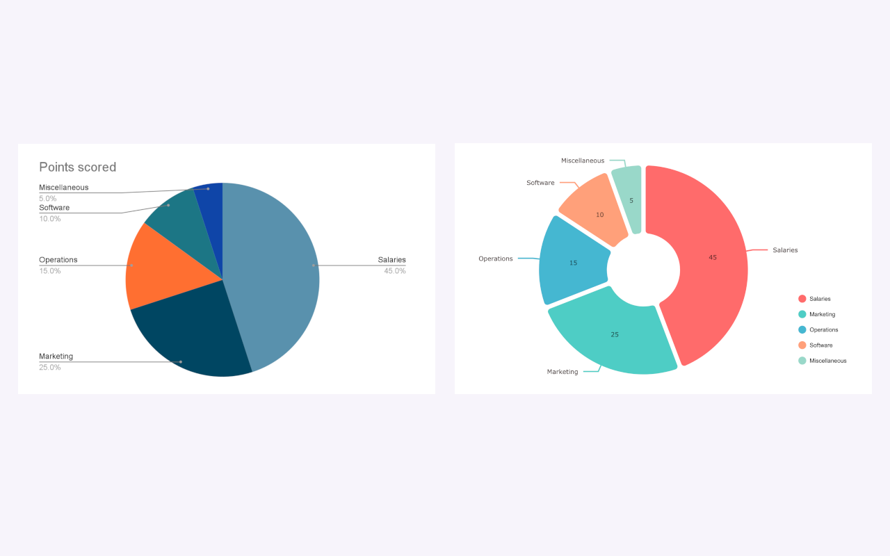 Compare the standard look with the modern, clean style of ExtraChart.
Best Practices for Pie Charts
To ensure your charts are effective and easy to read, follow these design rules:
1. Limit the Slices
Pie charts get cluttered quickly. Try to stick to 5 categories or fewer. If you have more, group the smaller values into an "Other" category.
2. Use Donut Charts for Modern Appeal
Donut charts are functionally identical to pie charts but often look cleaner and less "heavy" on a slide. The center hole also provides space for a total value or icon.
3. Order Your Data
Sort your data from largest to smallest (clockwise) to make it easier for the audience to compare the slice sizes intuitively.
4. Direct Labeling
Whenever possible, place labels directly on or next to the slices rather than using a separate legend. This reduces eye movement and makes the chart faster to read.
Final Thoughts
While Google Slides™' native chart tool is sufficient for basic needs, it can be cumbersome for frequent presentations. If you want to save time and create more impressive visuals, creating charts directly in Slides with a tool like ExtraChart is the better workflow.
Ready to upgrade your presentations?
Create Stunning Pie Charts Instantly
Try ExtraChart to build professional Pie and Donut charts directly in Google Slides™.
Get Started for Free