Stop Using Grouped Bar Charts: 5 Better Ways to Show Comparisons in Google Slides
July 5, 2026
Let's be honest. You've built a grouped bar chart, squinted at your slide, and thought, "This is a mess."
We've all been there. You have three product lines and want to compare their quarterly sales. The grouped bar chart seems like the default choice. But as soon as you add the data, you get a visual traffic jam. A rainbow of bars so cluttered that your audience spends more time decoding the legend than understanding your point.
The grouped bar chart is the Swiss Army knife of comparisons—it can do the job, but it’s rarely the best tool for it. When you have more than two series or categories, it becomes an exercise in frustration.
It’s time to upgrade your data storytelling. Here are five better ways to show comparisons in Google Slides.
1. The Multi-Series Line Chart: For Trends Over Time
If your categories are points in time (days, months, quarters), a grouped bar chart is almost always the wrong choice. It makes it hard to see the trajectory of a single series.
A multi-series line chart is built for this. It connects the dots, making trends instantly obvious. You can immediately see which product is growing, which is stagnating, and where they cross over.
When to use it: Comparing performance of multiple categories across a time period (e.g., website traffic from different sources over 12 months).
2. The Stacked Bar Chart: For Part-to-Whole Comparisons
Sometimes you don't just care about individual performance, but also how each part contributes to a total. A grouped bar chart completely fails at this—you can’t see the total for each quarter at a glance.
A stacked bar chart elegantly shows both. You can see the total sales for each quarter and the breakdown by product line. For even clearer relative comparisons, use a 100% stacked bar to show market share or percentage contribution.
When to use it: Showing how different segments contribute to a total revenue figure each month.
3. The Slope Chart: For a Clean Before-and-After
Need to show a simple change between two points? Two groups of bars are overkill. A slope chart is a minimalist and powerful alternative.
It's essentially a line chart with only two points in time. It uses lines to connect the starting and ending values for multiple categories, making it incredibly easy to spot the biggest winners and losers without any extra visual noise.
When to use it: Comparing market share from last year to this year, or pre-campaign vs. post-campaign survey results.
4. The Bullet Chart: For Performance Against a Target
Is your data about hitting a goal? A grouped bar chart just shows a value; it doesn't provide any context about whether that value is good or bad.
Enter the bullet chart. It’s a data visualization masterpiece. It displays a primary measure (like revenue-to-date), compares it to a target (the goal), and displays it in the context of qualitative ranges (like poor, average, and good). It packs a massive amount of information into a tiny space.
When to use it: Tracking individual sales rep performance against their quotas.
5. The Radar Chart: For Multi-Dimensional Comparisons
This is my favorite. What if you're not comparing a single metric, but several attributes across different items? Trying to show this with bars would require multiple charts and a lot of head-turning from your audience.
A Radar Chart (or Spider Chart) maps different variables on different axes radiating from a central point. It's perfect for showing which item is the best all-rounder or where its specific strengths and weaknesses lie.
Just look at this comparison of different laptops. You can instantly see which one excels in battery life versus processing power. A grouped bar chart could never do this so clearly.
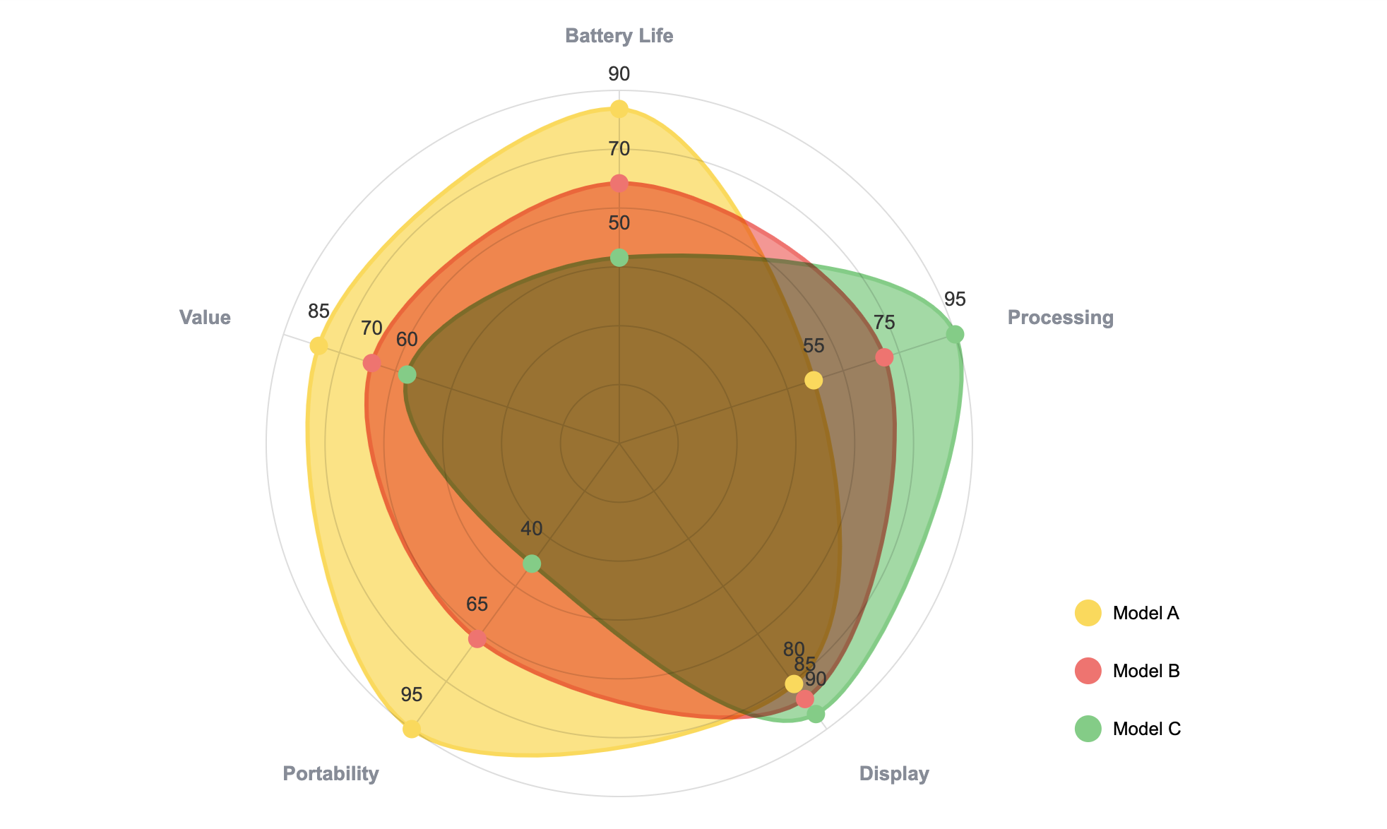
When to use it: Comparing products across features, candidates across skills, or brands across perception metrics.
"But Google Slides Can't Make These..."
You're right. The native chart tool in Google Slides is basic. You'll struggle to create a decent radar chart, and you can forget about bullet charts entirely. Most people give up and retreat to the familiar mess of the grouped bar chart.
This is exactly why we built ExtraChart.
ExtraChart is a Google Slides add-on that lets you build all these advanced charts (and 15 others) without ever leaving your presentation.
Here’s how it works:
- Open ExtraChart from the Extensions menu.
- Select a chart type, like the Radar Chart.
- Paste your data directly from Google Sheets or Excel into our simple data editor.
- Customize colors, labels, and fonts to match your brand.
- Click "Create," and a beautiful, high-resolution chart appears on your slide.
Best of all? The charts are updatable. If you need to change a data point, just select the chart, open ExtraChart, and it loads your data and settings right back up. No more rebuilding from scratch.
Stop letting your tools limit your message. The next time you need to show a comparison, skip the default grouped bar chart. Choose a chart that tells a clearer story, and use ExtraChart to build it in seconds.