Stop Screenshotting Power BI: Create Live Dashboards in Google Slides
July 8, 2026
It’s 9 AM on Monday. You’re presenting the latest quarterly numbers to the leadership team. You click to the slide with your key Power BI dashboard, and someone points out, "Wait, that data looks like it's from last Friday."
Your heart sinks. You forgot to update the screenshot.
We’ve all been there. The painful, manual process of exporting visuals from Power BI, pasting them into Google Slides, and praying the data doesn't change before the meeting. It’s a workflow that’s slow, error-prone, and leaves your presentations feeling like static, historical artifacts.
But what if your Google Slides dashboard could be a living document? What if updating it took seconds, not thirty minutes of frantic copy-pasting?
The Broken Workflow We All Accept
Let's be honest, the standard way to get Power BI visuals into Google Slides is terrible. It usually involves one of these clunky methods:
- The Screenshot Method: You take a screenshot, crop it, and paste it. The quality is often mediocre, you can't edit anything, and it's instantly outdated.
- The Export-to-Image Method: A slightly better option, but it's still a static image. If you need to change a color, a label, or, God forbid, the underlying data, you have to go back to Power BI and start all over.
- The Rebuild-from-Scratch Method: You export the data to a CSV, import it into Google Sheets, link a native Google Slides chart, and spend ages trying to make it look half as good as the original. When the data changes, you're stuck in a loop of updating the Sheet and clicking that little "Update" button on the chart, hoping it doesn't break your formatting.
These methods don't just waste time; they create a dangerous gap between your data and your decisions.
A Better Way: The "Refresh, Don't Rebuild" Mindset
The secret isn’t some complex, expensive integration. It’s a simple change in workflow, powered by the right tool. The goal is to create charts inside Google Slides that are just as powerful as your Power BI visuals but are also incredibly easy to update.
This is where our Google Slides add-on, ExtraChart, comes in. It’s designed to bridge this exact gap.
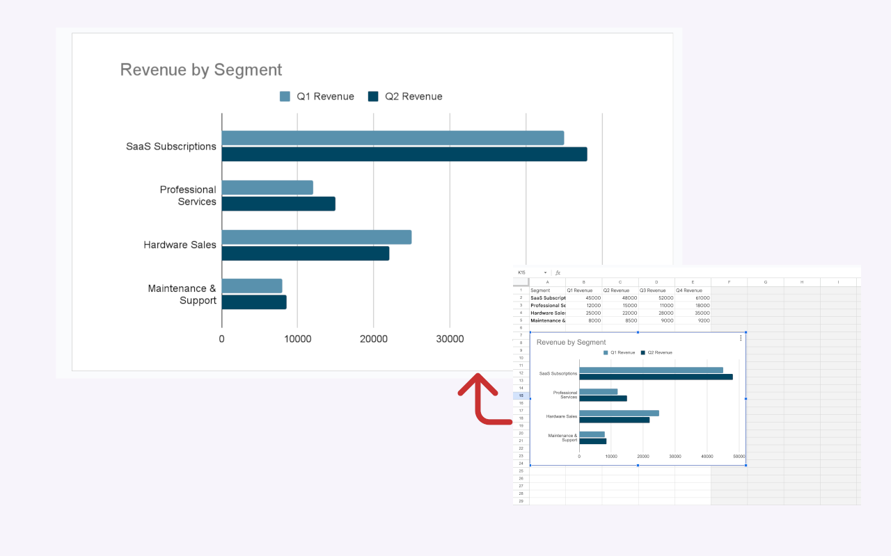
How to Create Your Live Power BI Dashboard in Slides
Here’s the step-by-step process. It’s so fast you’ll wonder why you ever did it the old way.
Step 1: Export Your Data from Power BI (as Data!)
This is the most important shift. Instead of exporting the visual, export the data behind it.
In Power BI, click the three dots (...) on your chosen visual and select "Export data". Choose the "Summarized data" option and save it as a CSV. This gives you a clean, simple table—exactly what you need.
Step 2: Build Your Chart in Seconds with ExtraChart
If you haven't already, install ExtraChart from the Google Workspace Marketplace.
Now, inside Google Slides:
- Go to Extensions -> ExtraChart -> Create & Edit Charts. The sidebar will open with 20 different chart types.
- Select the chart that matches your Power BI visual (e.g., a Grouped Bar Chart, a Funnel Chart, or even an advanced Radar Chart).
- The editor window will pop up. Go to the Data tab.
- Open your CSV file, select all the data (
Ctrl+AorCmd+A), and copy it. - Click on the first cell in the ExtraChart data editor and paste (
Ctrl+VorCmd+V).
That's it. Your data is in, and the chart preview instantly updates. You can now use the Settings tab to tweak colors, fonts, and labels to perfectly match your brand—all without leaving Google Slides. Click "Create," and a beautiful, high-resolution chart appears on your slide.
Step 3: The Magic Update—This is the "Live" Part
Okay, here’s where the magic happens. A week has passed, and you have new data in Power BI.
You don't have to rebuild anything.
- Export the new data from Power BI as a CSV, just like before.
- Go back to your Google Slide and simply click on the chart image you created with ExtraChart.
- Open the add-on again: Extensions -> ExtraChart -> Create & Edit Charts.
Because you selected the chart, ExtraChart automatically loads all your previous data and settings. The editor opens exactly where you left off.
Now, just go to the Data tab, paste in the new data from your fresh CSV, and click "Update".
Boom. Your chart is updated with the new numbers, but all your custom colors, font sizes, and styling are perfectly preserved. You just turned a 30-minute task into a 30-second one.
This Changes Everything
This "Refresh, Don't Rebuild" workflow means:
- Accuracy: Your presentations are always in sync with your latest data. No more stale screenshots.
- Efficiency: You save an incredible amount of time. No more rebuilding charts from scratch.
- Professionalism: You get crisp, high-resolution visuals that are fully editable and on-brand, not blurry, pixelated images.
Stop letting your presentation workflow hold you back. Give your data the dynamic, live home it deserves, right inside your Google Slides.