Stop Screenshotting Airtable: Build a Live, Self-Updating Dashboard in Google Slides
July 7, 2026
Let me guess. It’s Monday morning, and you’re prepping for the weekly team meeting. You open your beautiful, organized Airtable base, filter the data for last week’s performance, and hit Cmd+Shift+4.
You drag a neat little rectangle around your chart, paste the screenshot into Google Slides, and call it a day.
Then, just before the meeting, your boss asks, "Can you show that with the MTD numbers instead?" You scramble, re-filter, re-screenshot, and replace the old image. The new one is slightly misaligned and a bit blurry when you stretch it. We've all been there.
This workflow is broken. Screenshots are static, low-quality, and a complete time sink. There's a much better way.
The Problem with the Screenshot Method
Pasting screenshots of your data from Airtable, Notion, or any other tool is a habit we need to break. Here’s why:
- They're dead on arrival. The moment you take the screenshot, the data is frozen in time. When your Airtable base updates, your slide deck doesn't.
- They’re un-editable. Want to change a color to match your brand? Tweak a label? You can't. You have to go back to the source and start over.
- They look unprofessional. Let's be honest, screenshots often look blurry or pixelated, especially on high-resolution displays. They scream "I copied this from somewhere else."
You deserve a presentation that looks sharp and is easy to update. You need a dashboard, not a scrapbook of data pictures.
Building a "Living" Dashboard Inside Google Slides
What if your charts weren't static images? What if they were objects that held their own data and settings, ready to be updated with a few clicks, right inside your presentation?
This is exactly what you can do with our Google Slides add-on, ExtraChart.
Instead of leaving Google Slides to fetch your visuals, you create them directly where they'll be presented. The workflow is refreshingly simple.
The New Workflow: From Airtable to Slides in 60 Seconds
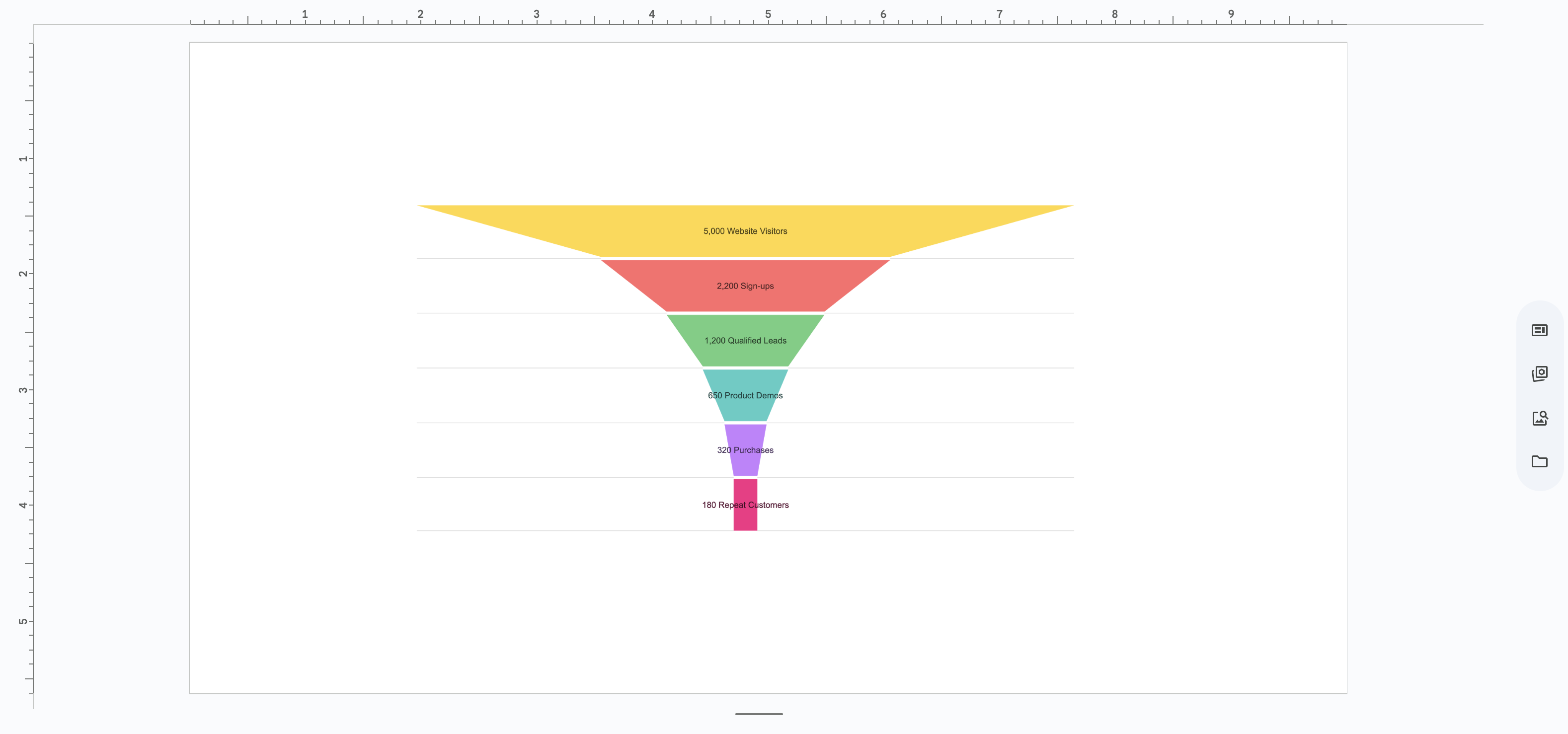
Let’s build a sales funnel chart as an example.
1. Copy Your Data
First, go to your Airtable base and copy the rows and columns for your funnel stages. Just a simple Cmd+C. No screenshotting!

2. Launch ExtraChart & Paste
Back in Google Slides, open ExtraChart from the menu: Extensions > ExtraChart > Create & Edit Charts. Select the Funnel Chart, and in the Data tab, paste your data directly into the editor. You'll see the chart preview update instantly.
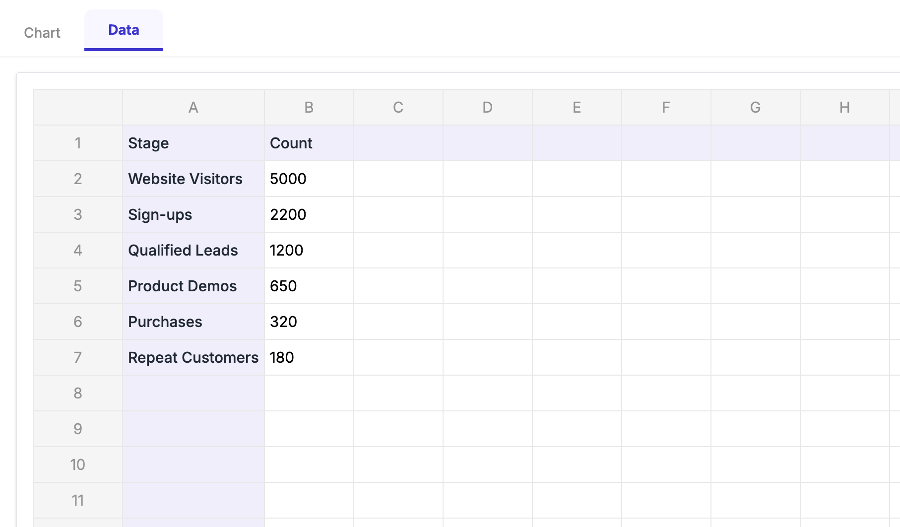
3. Customize It Now for the fun part. Head over to the Settings tab. Here, you can change everything—colors, fonts, spacing, labels. You have granular control to make the chart look exactly how you want it, not how Airtable dictates.
4. Insert Your Chart Click "Create," and a crisp, high-resolution chart is inserted onto your slide. It looks professional because it was built for your presentation, not screenshotted from another app.
The Magic: "Self-Updating" Charts
Okay, here’s where you win back your Monday morning.
Next week, when you have new numbers, you don't repeat the whole process. You simply:
- Select the chart image on your slide.
- Open the ExtraChart sidebar again.
- The add-on automatically loads your existing data and settings.
- Copy the new numbers from Airtable and paste them into the Data tab.
- Click "Update."
That’s it. Your chart is updated with the new data, keeping all your custom styling intact. You’ve just turned your static report into a reusable dashboard template.
Stop the screenshot madness. Start building dynamic, professional, and easily updatable reports directly in Google Slides.
Install ExtraChart from the Google Workspace Marketplace and try it for free. Your future self will thank you.