Stop Embedding Looker Studio Reports. Your Slides Deserve Better.
July 6, 2026
You’ve been there. The quarterly business review is in ten minutes. You have your beautiful, interactive Looker Studio (formerly Data Studio) dashboard ready to go.
So you grab the embed link, paste it into Google Slides, and feel pretty clever. It’s live! It’s interactive! What could go wrong?
Everything.
The slide takes forever to load. The permissions are wrong for half the people in the meeting. Or worse, the dashboard is so dense that while you're trying to highlight Q2 revenue, your boss is already clicking on filters and asking about Q4 churn. You've lost the room.
The problem isn't the data; it's the delivery. Embedding a live dashboard is great for analysis, but it's terrible for storytelling.
The Illusion of Interactivity
We embed dashboards because we think it makes our presentations more dynamic. In reality, it does the opposite. It outsources a key part of our story to a black box we can't control.
- You lose narrative control. A presentation is a guided journey. An embedded dashboard is a "choose your own adventure" novel. It invites your audience to explore instead of listening to the specific point you’re trying to make.
- It breaks the visual flow. The embedded report rarely matches your presentation's theme, fonts, or colors. It looks like what it is: a clunky iframe, clumsily pasted into an otherwise polished deck.
- It’s unreliable. Live embeds depend on internet speed, service uptime, and correct user permissions. They are a technical failure waiting to happen at the worst possible moment.
A presentation isn’t a browser window. It's a stage. And every element on that stage should serve the story you're telling.
Build Your Dashboard Where You Tell Your Story
The solution is to stop embedding and start building your dashboards natively, right inside Google Slides.
Think of each chart as a separate slide or a build-up element. You introduce the "Monthly Recurring Revenue" chart first. You talk about it. Then, you click, and the "Customer Acquisition Cost" chart animates onto the screen next to it.
You control the pacing. You direct the audience's focus. You build your argument piece by piece.
The charts look like they belong because they do. They use the same brand colors, the same fonts, and the same clean aesthetic as the rest of your slides. It's a seamless, professional experience.
"But," you say, "Google Slides' native charts are basic and ugly!"
You're absolutely right. And that’s why we built ExtraChart.
The Power of Native Charts, Without the Limitations
ExtraChart is a Google Slides add-on that lets you create publication-quality, fully updatable charts without ever leaving your presentation. It bridges the gap between the narrative power of native slides and the data-richness of a BI tool.
This is what you lose when you import a basic chart from Google Sheets, and what you can never achieve with an ugly Looker Studio embed.
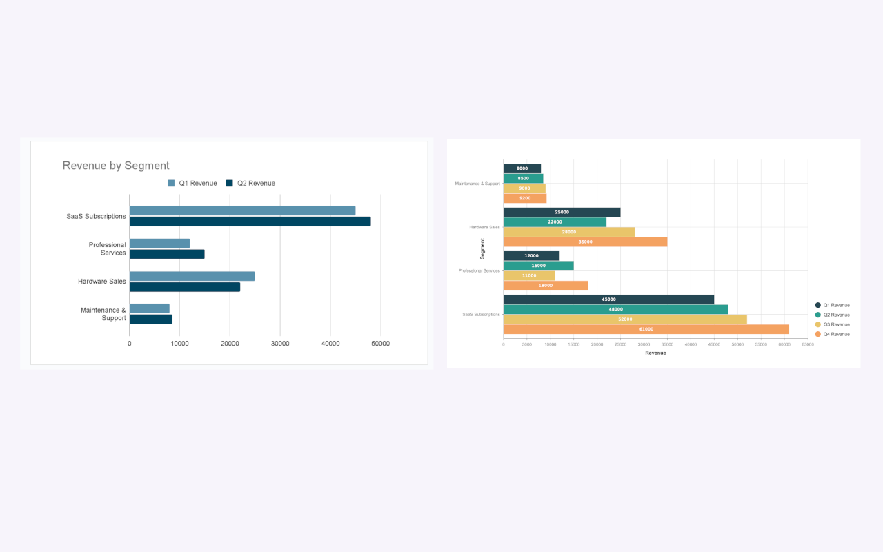
Instead of wrestling with an iframe, you can:
1. Create Sophisticated Visuals
Google Slides gives you a handful of basic charts. ExtraChart gives you 20, including specialized types perfect for business dashboards like Funnel Charts, Bullet Charts, and Radar Charts. You finally have the right tool for the job.
2. Maintain Full Brand Control
Forget mismatched styles. With ExtraChart's deep customization options, you can tweak every element—from the exact spacing between bars to the font weight on your axes. Save your brand hex codes in the Color Palette Manager and apply them with a single click.
3. Update Data in Seconds
Here’s the killer feature. A chart made with ExtraChart isn't a dead image. Need to update last month's numbers? Just select the chart, open ExtraChart from the menu (Extensions > ExtraChart > Create & Edit Charts), and the original data and settings are right there. Paste the new data, click "Update," and you're done.
You get the freshness of a live dashboard without sacrificing narrative control.
Take Back Your Narrative
Your data has a story to tell. Don't let a clunky, unreliable embed get in the way.
By building your dashboards natively in Google Slides with a tool like ExtraChart, you create presentations that are more persuasive, more professional, and far more reliable. You guide your audience, you own the stage, and you make your point with clarity and impact.
Give it a try. Your next presentation will thank you for it.