How to Visualize E-Commerce Cart Abandonment in Google Slides Using a Funnel Chart
May 24, 2026
Seven out of ten people who put an item in your digital cart will just walk away.
Think about that. You spend thousands of dollars on ads, SEO, and slick social media campaigns just to get shoppers to your site. They click the product. They hit "Add to Cart." And then? Ghosted.
Finding out where they drop off is a job for your analytics software. But getting the budget to fix that specific drop-off point? That requires pitching your boss or the executive team.
Let's be honest. Nobody wants to stare at a dense spreadsheet during a Monday morning strategy meeting. If you want stakeholders to act fast, you have to show them the bleed. You need a funnel chart.
Here is exactly how to build a high-converting e-commerce funnel chart directly inside Google Slides.
The Problem with Native Google Slides
If you've ever tried to build a funnel chart using the default Google Slides tools, you already know the pain.
You usually end up doing one of two things. Either you try to hack a stacked bar chart into looking like a funnel (which almost never works), or you spend 45 minutes manually drawing and aligning trapezoid shapes.
And the worst part? When the conversion data updates next week, you have to redraw all those shapes manually.
You need something better.
The Fix: Building Your Funnel with ExtraChart
To skip the headache, I use ExtraChart. It's an add-on built specifically for Google Slides that gives you access to 20 professional chart types—including a dedicated funnel chart.
You don't have to jump between tabs, and you never have to mess with a shape tool again.
Step 1: Gather Your Conversion Data
Before you open your presentation, jot down your user journey numbers. For a standard e-commerce flow, it usually looks like this:
- Website Visitors: 10,000
- Product Page Views: 6,500
- Add to Cart: 2,100
- Checkout Initiated: 850
- Purchases: 320
Step 2: Open ExtraChart
Open your Google Slides presentation. Go to the top menu and click Extensions -> ExtraChart -> Create & Edit Charts.
The ExtraChart sidebar will slide open on the right side of your screen. Look through the "Business & Analytics" category and click the Funnel Chart icon.
Step 3: Paste Your Data
A clean popup editor will appear. On the right side, you'll see a lightweight spreadsheet interface.
Just copy your data (the stages and the numbers) from Google Sheets or Excel, and paste it directly into the ExtraChart data tab. You'll see the chart preview on the left update instantly. No lagging, no waiting.
Step 4: Customize Your Chart
This is where you make it presentation-ready.
Switch over to the Settings tab. You have total control here. I highly recommend adjusting the colors to match your brand palette. ExtraChart has a built-in Color Palette Manager, so you can easily punch in your company's exact hex codes.
Make the labels bold. Tweak the spacing. Get it looking exactly how you want it.
Step 5: Insert and Update
Hit "Create." The add-on drops a crisp, high-resolution image of your funnel chart right onto your active slide.
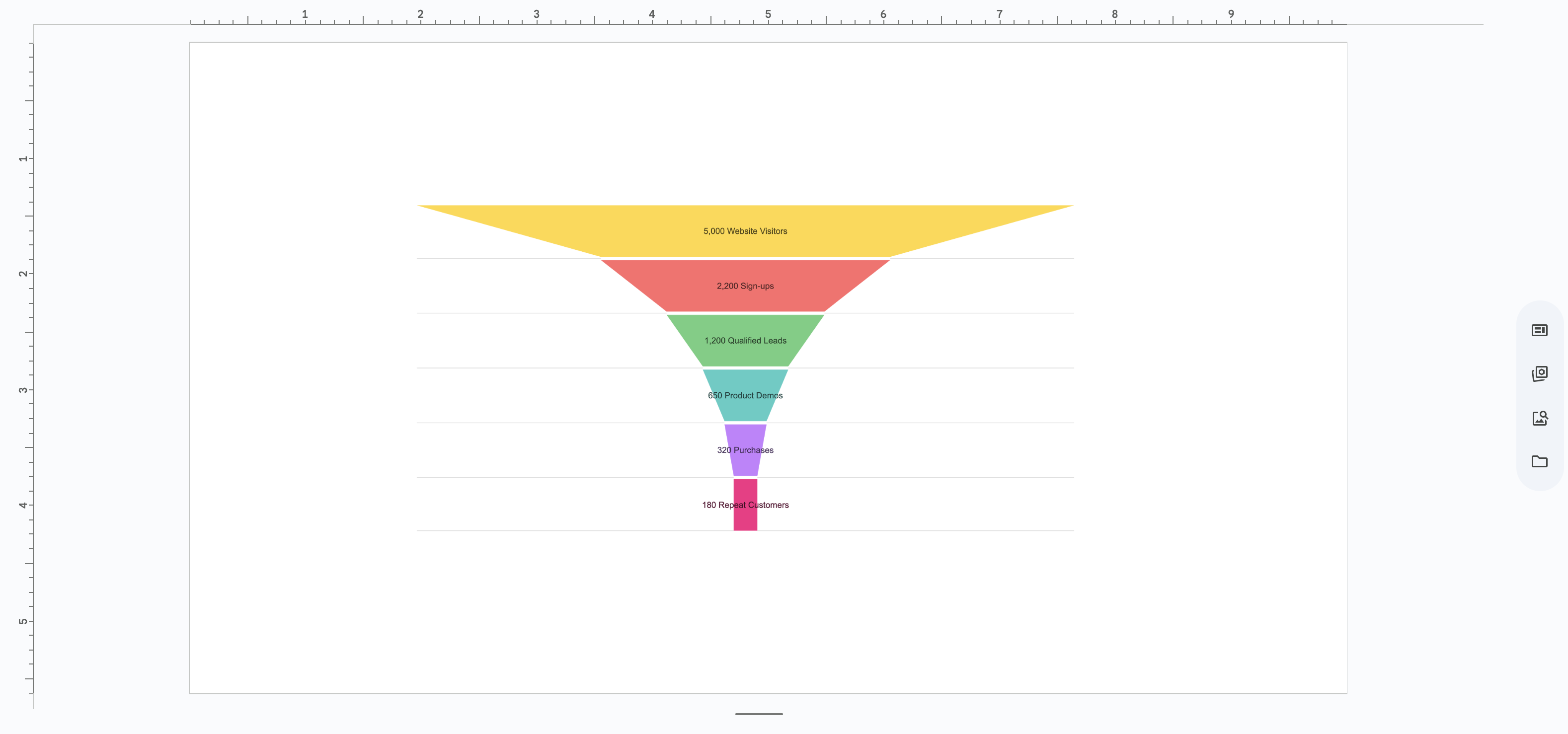
Here is the absolute best part about using ExtraChart. Next month, when your checkout optimization experiments run and your conversion numbers change, you don't have to rebuild this chart.
Just click the image of the chart on your slide, open the ExtraChart add-on, and it will pull up your exact data and settings. Change the numbers, hit update, and you're done.
Stop Guessing, Start Fixing
Cart abandonment isn't just a marketing problem; it's a bottom-line revenue problem.
When you visualize the drop-off clearly, the conversation shifts from "Are we losing sales?" to "Let's fix the checkout page right now."
By using ExtraChart directly inside Google Slides, you save hours of busywork while building presentations that actually drive action. Give it a try for your next team meeting, and watch how quickly people understand the data.