How to Make a Graph on Google Slides (The Easy Way to Create Stunning Visuals)
January 27, 2026
If you’ve ever tried to visualize complex data in Google Slides, you’ve probably hit a wall. The built-in charting tools are… fine. They work for basic bar charts and simple pie charts. But what if you need a Funnel chart to show conversion rates? or a Radar chart to compare product features? Or a Heatmap to visualize performance across different metrics?
Most people end up creating these in Excel or specialized design software and pasting screenshots. But that breaks the moment you need to update the numbers.
In this guide, I’ll show you exactly how to make a graph on Google Slides using the standard tools, and then I’ll share a powerful add-on that unlocks 15+ advanced chart types directly inside your presentation.
Method 1: The Standard Way (Built-in Tools)
Google Slides has a native integration with Google Sheets. It’s the default way to add simple charts.
- Open your Google Slide.
- Go to Insert > Chart.
- Choose your type (Bar, Column, Line, or Pie).
- Google creates a dummy chart. To edit the data, click the standard chain icon in the top right of the chart and select Open source.
- This opens a Google Sheet where you can type in your data.
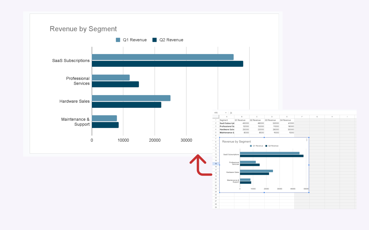 Managing charts between Sheets and Slides can sometimes feel disjointed.
The Downside? You are limited to the basics. If you want to impress your stakeholders with a Chord diagram or a specific Box Plot to show statistical distribution, the native tools just don't have them. You also have limited control over styling, often resulting in "generic-looking" presentations.
Method 2: The "Pro" Way (Using ExtraChart)
If you want your slides to look like they were designed by a professional data visualization expert, you need better tools. This is where ExtraChart comes in.
It’s a Google Slides add-on I built because I was tired of the limitations of standard charts. It lets you create advanced, data-rich visualizations without ever leaving slides.
Why use ExtraChart?
- 11+ Advanced Chart Types: Create Funnels, Radars, Heatmaps, Sankey-style Chord Diagrams, Box Plots, and Stream graphs.
- Fully Customizable: Unlike the rigid default charts, you can tweak everything. Want to change the interpolation of your funnel? Adjust the shape blending? You have full control.
- Brand Data Consistency: Use your exact brand hex codes with the built-in Palette Drawer. You can save your brand colors and apply them to any chart instantly.
- Live Editing: Tweak data and settings right in the sidebar and watch the chart update instantly on your slide.
How to create a graph with ExtraChart:
- Install the Add-on: Link to ExtraChart marketplace
- Open the Sidebar: In Google Slides, go to Extensions > ExtraChart > Create & Edit Charts.
- Choose Your Chart: Select from the wide variety of premium charts (e.g., choose "Funnel" for your sales pipeline).
- Edit Data: You don't need a separate spreadsheet. Just plug your numbers directly into the simple data table in the data tab.
- Customize: Use the chart editor sidebar to adjust colors, labels, spacing, and style.
- Pro Tip: Use the "Palette Drawer" to save your company's color scheme for consistent charts every time.
- Insert: Click Insert the chart to instantly generate and place the professional-quality chart directly onto your slide.
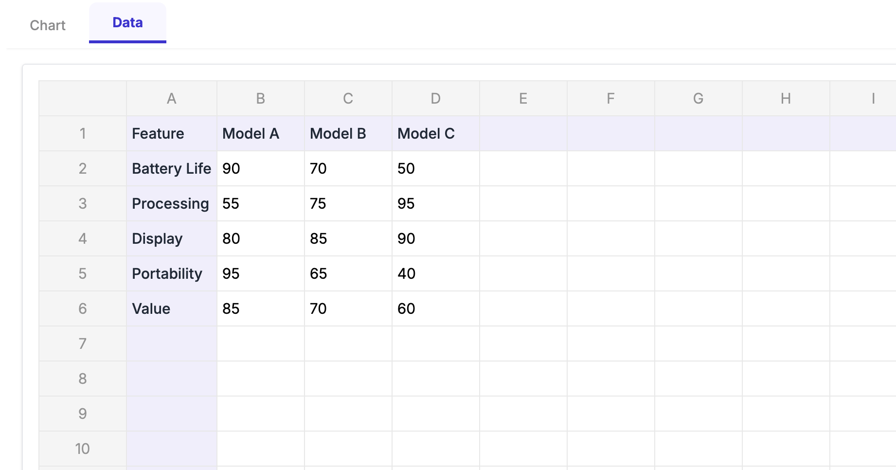 The ExtraChart sidebar lets you edit data and style settings without leaving Google Slides.
Choosing the Right Chart for Your Data
Not sure which graph to use? Here is a quick cheat sheet:
| If you want to show... | Use this Chart |
|---|---|
| Sales stages or drop-offs | Funnel Chart (Exclusive to ExtraChart) |
| Performance across multiple categories | Radar / Spider Chart |
| Complex relationships or flows | Chord Diagram |
| Data density and patterns | Heatmap |
| Statistical distribution & outliers | Box Plot |
| Trends over time (with volume) | Stream Graph |
Conclusion
Standard Google Slides charts are okay for placeholders, but they rarely tell the full story. By using a tool like ExtraChart, you can turn dry data into compelling, professional stories that actually keep your audience engaged.
Don't settle for boring bars and lines. Give your data the presentation it deserves.
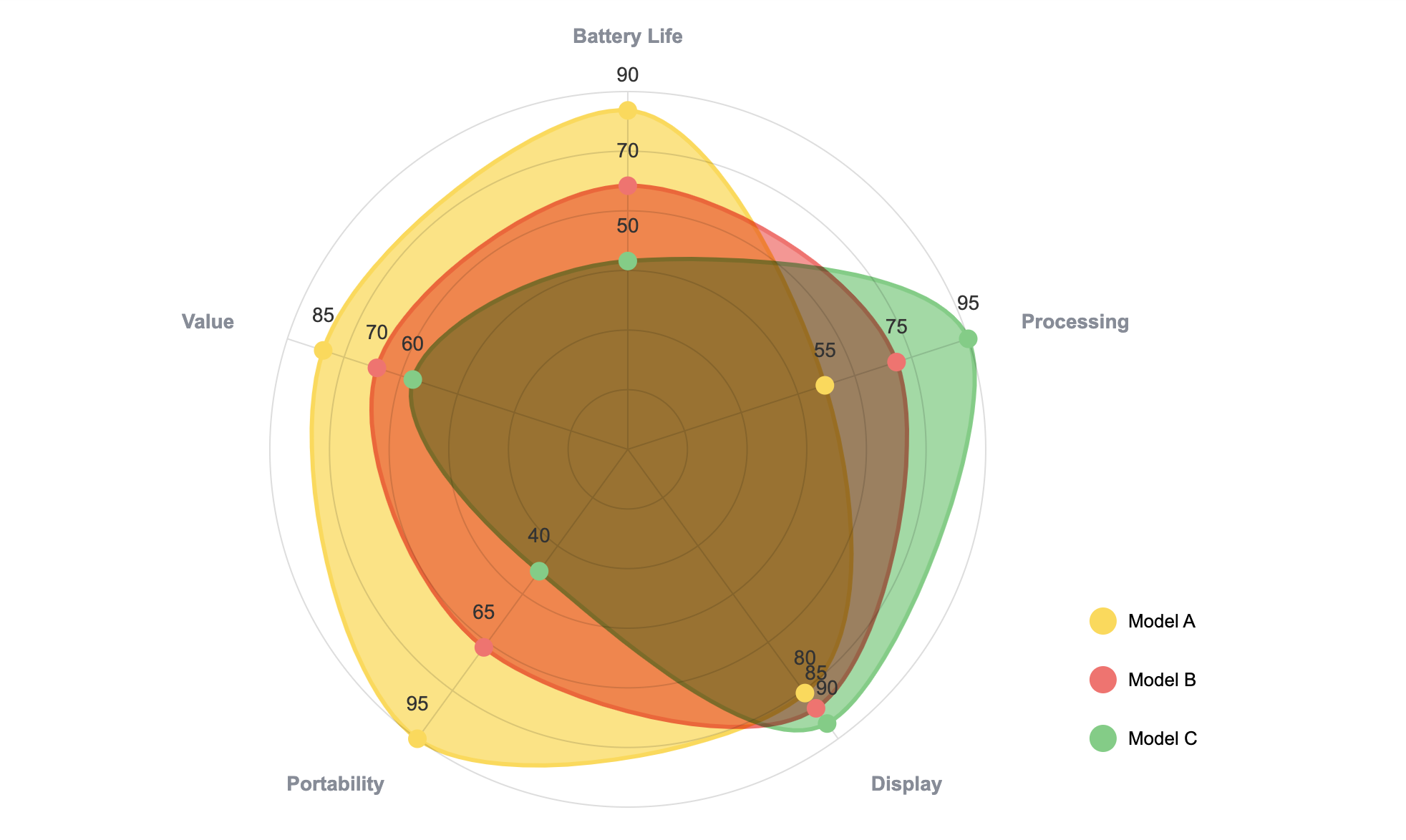 An example of the kind of professional visualization you can create in minutes.
Try ExtraChart for Google Slides today
Create Stunning Spider Charts Instantly
Try ExtraChart to build professional spider charts directly in Google Slides™.
Get Started for Free