7 Google Slides Chart Mistakes That Kill Your Credibility (and How to Fix Them Fast)
July 10, 2026
You’ve done the hard work. You wrestled the data, found the key insight, and now it’s time to present it. You drop a chart into Google Slides and... it just looks... off.
It's a feeling we all know. The default charts are clunky. The colors are garish. The labels are a mess.
Here’s the tough truth: a bad chart doesn't just look unprofessional; it makes your entire argument look weak. It silently tells your audience, "This person doesn't care about the details." It kills your credibility before you even start talking.
But here's the good news. Most of these mistakes are easy to fix. I'm going to walk you through the seven deadliest sins of chart design in Google Slides and show you how to fix them fast.
Mistake #1: Using the Wrong Chart for the Job
This is the big one. You wouldn't use a hammer to turn a screw. So why are you using a pie chart to show growth over time?
The Problem: Using a pie chart for more than 5-6 categories, a line chart for static comparisons, or a bar chart for continuous data. It confuses your audience and misrepresents the information.
The Fast Fix: Match the chart to your story.
- Comparing values? Use a Bar or Column Chart.
- Showing change over time? Use a Line or Area Chart.
- Revealing parts of a whole? Use a Pie or Donut Chart (but keep it simple!).
- Tracking progress to a goal? A Bullet Chart is your best friend.
Native Google Slides charts are limited. For specialized stories, like tracking a sales pipeline, you need a Funnel Chart. That's where a dedicated tool becomes essential.
Mistake #2: The "Chartjunk" Overload
Edward Tufte coined the term "chartjunk" for all the visual fluff that distracts from the data. Google Slides' defaults are often guilty of this.
The Problem: 3D effects, dark backgrounds, heavy gridlines, and unnecessary borders. It's a visual assault that hides your core message in a sea of clutter.
The Fast Fix: Be a minimalist. Remove everything that doesn’t add value. Does that border help understanding? No? Get rid of it. Do you need a gridline for every single value? Probably not. The data is the hero—let it shine.
Mistake #3: The Rainbow Catastrophe
We've all seen it. The default multi-color palette that looks like a bag of Skittles exploded on your slide.
The Problem: Using too many colors, low-contrast combinations, or colors that have no connection to your brand. It looks cheap and makes the chart hard to read, especially for those with color vision deficiencies.
The Fast Fix: Create a focused color palette. Use shades of a single color to show intensity or pull 2-3 key colors directly from your company's brand guide. Consistency is key to looking professional.
This is often where the default tools fail. Just look at the difference between a standard Google chart and one with intentional styling.
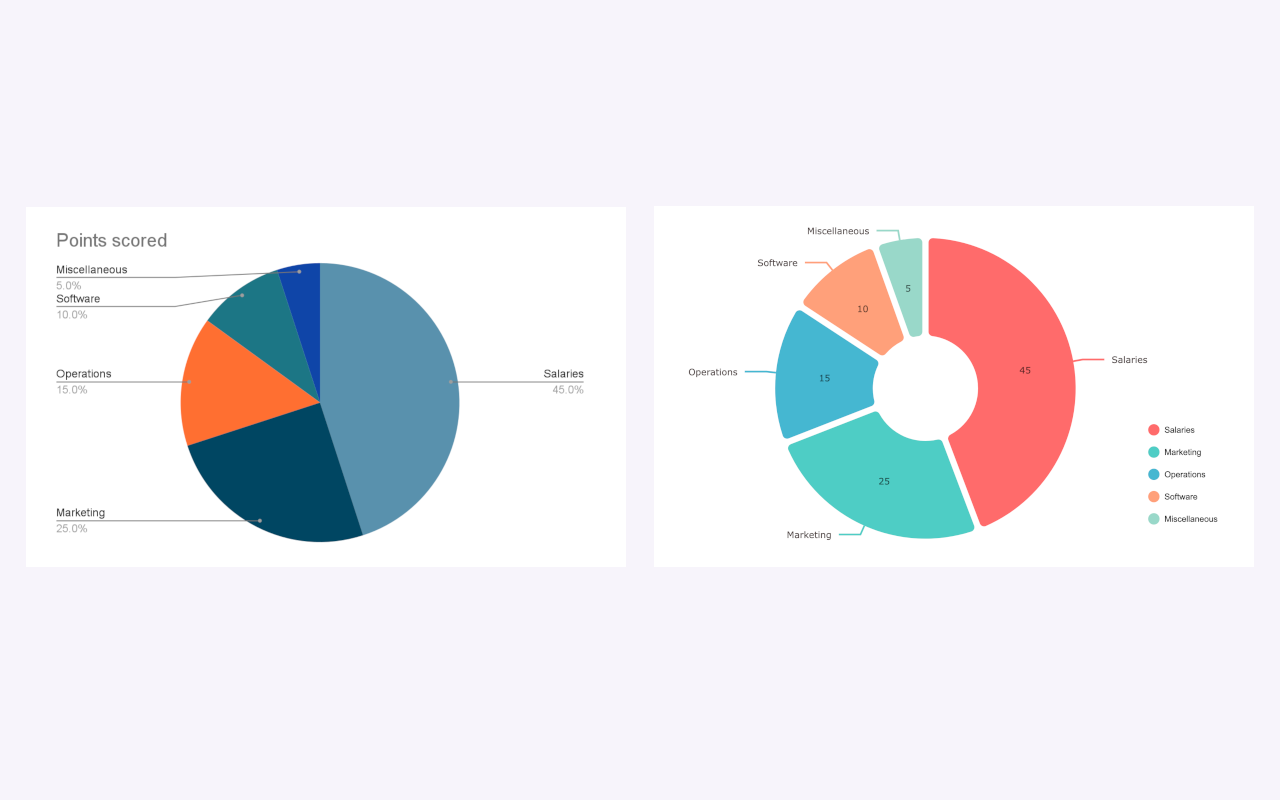
The one on the right just feels more trustworthy, doesn't it? That's the power of good design.
Mistake #4: The Unreadable Mess
What good is a chart if nobody can read the labels?
The Problem: Tiny fonts. Axis labels rotated 90 degrees, forcing your audience to crane their necks. Vague titles like "Chart 1". No units of measurement specified ($? %? Widgets?).
The Fast Fix: Clarity above all. Use a clean, legible font (like Roboto or Inter). Keep text horizontal whenever possible. Your axis labels should be descriptive, and your chart title should tell a story (e.g., "Q3 Sales Growth Surpassed Projections by 15%").
Mistake #5: The Deceptive Axis
This one isn't just a design mistake; it's an ethical one. Manipulating the Y-axis is a classic way to lie with statistics.
The Problem: Truncating the Y-axis on a bar chart (starting it at a value other than zero). This exaggerates differences and misleads the viewer. A 5% increase can be made to look like a 100% explosion.
The Fast Fix: Always start your bar chart's Y-axis at zero. Period. If you need to show small fluctuations in a large dataset, a line chart is often a more honest choice. Your audience's trust is worth more than a dramatic-looking bar.
Mistake #6: The Dead-End Screenshot
This is a workflow mistake that creates huge headaches.
The Problem: You create your chart in Google Sheets or Excel, take a screenshot, and paste it into Slides. Then, your boss spots a typo in the data. Now you have to go back to the spreadsheet, fix the number, create a new screenshot, and replace the old one. It’s a painful, error-prone cycle.
The Fast Fix: Create your charts inside the tool you're presenting with. You need a chart that is a living object, not a static, dead image.
This is exactly why we built the update feature in ExtraChart. You can select any chart you've made, open the add-on, and the original data and settings are right there. Tweak a number, change a color, and hit "Update". The chart is refreshed in place. No more screenshot gymnastics.
Mistake #7: The Data Dump
This final mistake separates the amateurs from the pros.
The Problem: The chart presents data, but it doesn't make a point. It's a collection of numbers without a narrative. You force your audience to do the work of interpreting it.
The Fast Fix: Your chart should be an argument. Use a clear, action-oriented title. Use a contrasting color to highlight the most important data point. Add a short text box or annotation to explicitly state the key takeaway. Guide your viewer to the "aha!" moment.
Stop Fighting Your Tools. Start Building Better Charts.
The native Google Slides chart editor is... fine. For a 5th-grade book report.
But when your credibility is on the line, "fine" isn't good enough. You need control. You need professional options. And you need an efficient workflow that doesn't involve juggling multiple applications.
That's where ExtraChart comes in. It’s a Google Slides add-on that solves every single one of these mistakes.
- 20+ Chart Types: From Funnel and Radar to Bullet and Box Plots, you'll always have the right tool for the job.
- Deep Customization: Control every element—fonts, colors, spacing, labels, and legends—to create clean, on-brand visuals.
- Color Palette Manager: Save your brand's hex codes and apply them to any chart with a single click.
- Updatable Charts: This is the game-changer. Fix a typo or update your data without ever leaving Google Slides.
Stop letting default settings dictate the quality of your work.
-> Install ExtraChart from the Google Workspace Marketplace (it's free to start!)
Take control of your data, build charts that command respect, and present your ideas with the confidence they deserve.